
Before the Film Began: The Lost Art of Title Sequences
There's a moment before Anatomy of a Murder begins—before James Stewart delivers his first line, before we meet Lee Remick or George C. Scott, before we even know what the murder is—when the film reveals everything you need to know.
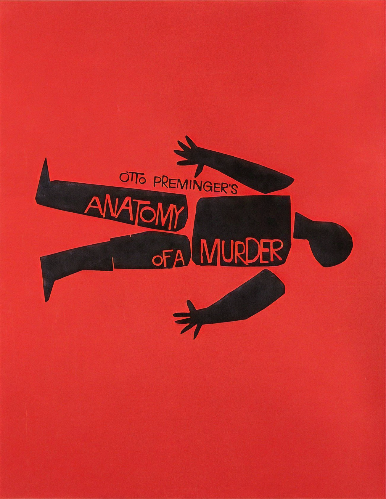
A jagged, disjointed figure, drawn in stark white lines against pure black. Pieces of a human form—fragmented, assembled, torn apart. The lines twist and reform, never quite resolving into a whole person. And beneath it all, Duke Ellington's score pulses with the syncopated rhythm of obsession.
These are the opening titles to Otto Preminger's 1959 courtroom drama, designed by Saul Bass, and they tell you in 90 seconds what the next 161 minutes will explore: how truth gets dissected, how evidence gets rearranged, how a human life can be pulled apart and reassembled to tell whatever story you need it to tell.
This was what title sequences used to do. They weren't just credits rolling over a static image. They weren't logos and production company cards. They were cinema—miniature films that set the mood, established the themes, and prepared you emotionally for what was coming.
And then, quite suddenly, they disappeared.
This is the story of title sequence design in its golden age, roughly 1955 to 1995, when opening credits were crafted by graphic designers who understood that those first few minutes weren't "popcorn time"—they were your first encounter with the film's visual language, its emotional temperature, its aesthetic DNA.
"Projectionists – Pull Curtain Before Titles"
Until 1955, movie theater projectionists had standing orders: keep the curtains closed during the opening credits. No one wanted to watch them. Credits were utilitarian information—nothing more than names and job titles rolling up the screen while audiences bought popcorn and settled into their seats.
Then Otto Preminger and Saul Bass made The Man with the Golden Arm.
The note attached to the film cans was unprecedented: "PROJECTIONISTS – PULL CURTAIN BEFORE TITLES."
The titles were the show. Bass's animated sequence—a jagged, distorted arm reaching from the darkness, fragmenting and reforming—was so arresting, so viscerally connected to the film's subject (heroin addiction), that Preminger insisted audiences see it. The arm wasn't decorative. It was the visual embodiment of the junkie's existence: disjointed, desperate, reaching.
In Bass's own words: "My initial thoughts about what a title can do was to set mood and the prime underlying core of the film's story, to express the story in some metaphorical way. I saw the title as a way of conditioning the audience, so that when the film actually began, viewers would already have an emotional resonance with it."
This was the moment title sequences became an art form. Not credits over something, but credits as something.
The Language of Kinetic Typography
What made Bass's work revolutionary wasn't just that it was visually striking—it was that he invented a new grammar for how text could move, behave, and mean on screen.
Before Bass, typography in film was static. Names appeared, stayed on screen for a few seconds, dissolved. It was borrowed from print design, translated to film without transformation. Bass understood that film was a fundamentally kinetic medium, and that text should move with the same choreographic precision as a dancer or a camera.
Look at Anatomy of a Murder again. The figure isn't just drawn—it's animated, dissected in real-time, the pieces shifting and recombining like evidence being presented to a jury. The typography doesn't just list names; it participates in the visual metaphor. Every element is calibrated to the rhythm of Ellington's score.
Or consider Seconds (1966), John Frankenheimer's hallucinatory science fiction thriller about a man who undergoes surgery to become someone else. Bass's titles show us distorted human faces—stretched, warped, twisted through a fish-eye lens, accompanied by Jerry Goldsmith's piercing organ score. We're watching identity dissolve before the film even begins. We're experiencing body horror at the level of pure abstraction.
This is what kinetic typography could do: make you feel the film's themes before a single frame of the narrative appeared.
Criterion Case Study: Saul Bass's Masterpieces
The Criterion Collection has preserved several of Bass's greatest title sequences, and examining them reveals how versatile and conceptually rigorous his work was. Every sequence solves a unique problem—how to visually express the film's core tension in 90 seconds or less.
Anatomy of a Murder (1959) – Spine #600
The Problem: How do you open a courtroom drama that's fundamentally about the manipulation of truth?
Bass's Solution: A fragmented human figure, constantly disassembling and reassembling. The figure is never whole, never stable. It's evidence. It's a crime scene diagram. It's a body reduced to argument.
The sequence works on multiple levels: formally (it's stunning), narratively (it introduces the central metaphor), and musically (those lines move like Ellington's jazz—improvised, syncopated, alive). When the actual film begins, you're already primed to think about how stories get constructed, how evidence gets arranged, how truth is always fragmentary.
Spartacus (1960) – Spine #105
The Problem: How do you open a historical epic without drowning the audience in grandiosity?
Bass's Solution: Focus on hands. Human hands. Hands that are chained, hands that break chains, hands reaching toward freedom. Set against a blood-red background, these simple silhouettes tell the entire story of slavery and rebellion without a word.
What's remarkable is the restraint. Bass could have given Kubrick (and producer Kirk Douglas) something operatic, something that matched the film's massive scale. Instead, he gave them something intimate: the human cost of oppression, rendered as pure gesture. It's one of the most effective political statements in cinema, and it lasts less than two minutes.
Seconds (1966) – Spine #667
The Problem: How do you convey existential dread and body horror without showing the actual plot?
Bass's Solution: Distorted close-ups of human facial features—eyes, mouths, skin—seen through a warped lens. The typography (set in Helvetica, Bass's favorite typeface) appears clean and modern, but the faces beneath it are nightmarish, almost surgical. You're looking at human features as if they're specimens, objects to be manipulated.
This is Bass at his most viscerally unsettling. The sequence feels like being on an operating table, seeing your own face through anesthesia haze, recognizing nothing. It's a masterclass in how abstraction can be more frightening than explicit imagery. By the time Rock Hudson appears on screen, you're already uncomfortable in your own skin.
Beyond Bass: The Pantheon of Title Designers
Bass wasn't working in a vacuum. The golden age of title design—roughly 1955 to 1995—produced several other masters whose work deserves recognition.
Pablo Ferro: Typography in Motion
If Bass made typography move, Pablo Ferro made it speak. His rapid-fire, staccato approach to credits felt like the visual equivalent of bebop jazz—syncopated, energetic, improvisational.
His title sequence for Dr. Strangelove (1964) is a masterpiece of wartime irony. Ferro designed hand-drawn lettering that looks vaguely military but also somehow playful, childlike. The credits appear over footage of planes refueling mid-air—an image that Kubrick intentionally filmed to look sexual, mechanical copulation in the sky. Ferro's typography dances across this imagery, light and bouncy, set to "Try a Little Tenderness."
The dissonance is perfect. The world is about to end, and the credits are charming. It's Kubrick's dark humor distilled to pure visual form, and it sets the tone for everything that follows.
Ferro later designed the titles for The Thomas Crown Affair (1968), pioneering the split-screen technique that would be endlessly imitated, and Bullitt (1968), where his typography has the same muscular energy as Steve McQueen's driving.
Maurice Binder: The Bond Formula
Maurice Binder designed the opening titles for fourteen James Bond films, creating a visual language so iconic that it's now inseparable from the franchise itself: silhouetted figures (usually women) moving against bright, psychedelic colors; the gun barrel sequence; 007 integrated into the design.
What Binder understood—and what made the Bond titles work for decades—is that these sequences needed to function as palate cleansers. Bond films always opened with an action prologue, often unrelated to the main plot. The title sequence was where you transitioned from that explosive opening into the actual story. Binder's designs, set to those unmistakable John Barry scores, gave you permission to catch your breath, to settle into the film's particular flavor of glamorous danger.
This wasn't art-house cinema. It was commercial filmmaking at its most sophisticated, and Binder understood that his job was to sell the fantasy—to make you want to be in that world of martinis and Aston Martins and women emerging from waves in slow motion.
Richard Williams: When Animation Ruled
Richard Williams brought animation techniques to title design in ways that felt genuinely cinematic rather than cartoonish. His titles for What's New Pussycat? (1965) and A Funny Thing Happened on the Way to the Forum (1966) used cel animation with graphic design sensibility, creating sequences that matched the films' manic energy.
But his masterpiece is The Return of the Pink Panther (1975), where the animated Pink Panther character became more famous than the films themselves. Williams understood that animation could create a tone—sophisticated slapstick—that live-action couldn't match. Those sequences made you feel smart for laughing at them.
The Death of a Craft
By the mid-1990s, the art of title sequence design was essentially dead. What happened?
Television happened. Specifically, television production techniques bled into cinema. As films began to be shot and edited digitally, title design became something you could do in post-production rather than something you planned during pre-production. It became cheaper, faster, more flexible—and infinitely less interesting.
Marketing happened. Studios realized they could use the first few minutes of a film for production company logos, studio logos, producer logos, distributor logos. Those logos became mini-advertisements, branding exercises. By the time the actual credits started, audiences were already disengaged.
But mostly, ambition died. The golden age of title sequences coincided with a period when filmmakers saw every element of cinema as an opportunity for creativity. Preminger didn't have to commission Saul Bass. He could have just rolled credits over a still image like everyone else. But he understood that those 90 seconds were part of the film, not decoration.
Modern filmmakers—with a few notable exceptions—don't think that way. Title sequences are seen as utilitarian necessities, not creative opportunities. You get a production company logo, some text on black, and then the film begins. The idea that the credits themselves could be cinema seems almost quaint now.
What We Lost
Here's what bothers me most about the death of title sequence design: we lost a buffer zone between the outside world and the film's world.
Think about what happens when you watch a movie now. You see the studio logo (which is just branding), maybe some producer cards, and then you're immediately in the narrative. There's no transition, no preparation, no moment where the film teaches you how to watch it.
The great title sequences did exactly that. They were pedagogical devices disguised as entertainment. They said: "This is the visual language we're using. This is the emotional temperature. This is the tone. Adjust accordingly."
Anatomy of a Murder's fragmented figures tell you to watch for how evidence gets manipulated. Seconds' distorted faces tell you to question identity and surfaces. Dr. Strangelove's playful typography over warplanes tells you that horror and comedy are about to merge in uncomfortable ways.
Without that buffer, films feel more abrupt, more jarring. You're thrown into the story before you're ready to receive it. It's the difference between walking into a concert hall while the orchestra is already playing versus walking in during the overture. The overture prepares you. It attunes your ear. It makes the symphony that follows more powerful.
The Rare Exceptions
A handful of contemporary filmmakers still understand this. David Fincher, who grew up studying Saul Bass, commissioned Kyle Cooper to design the opening titles for Se7en (1995), a sequence so influential it spawned a thousand imitators. Those scratchy, hand-processed letters, scored to Nine Inch Nails, don't just look cool—they put you inside the killer's head before you've met him.
The Coen Brothers' The Man Who Wasn't There (2001) opens with titles designed by Big Film Design that evoke 1940s noir title cards—white text on black, period-appropriate typography—acknowledging that title sequences themselves have history, that they're part of cinema's visual vocabulary.
And Wes Anderson, perhaps unsurprisingly, treats title cards as formal elements throughout his films, though his approach is more within the narrative than before it. Still, there's a reverence for the craft, an understanding that how you present information visually matters.
But these are exceptions. The default now is utilitarian text, quickly disposed of, forgettable. We've lost the idea that the credits could be art.
Preservation and Legacy
This is where the Criterion Collection becomes essential. By preserving and restoring films like Anatomy of a Murder, Seconds, Dr. Strangelove, and Spartacus, Criterion isn't just preserving the main features—they're preserving these title sequences, these miniature films-before-films that represent a lost craft.
When you watch a Criterion release, you're seeing these sequences the way they were meant to be seen: as the opening statement, the first brushstroke, the initial gesture. You're experiencing cinema as a complete medium, where every frame—including the credits—is intentional, crafted, meaningful.
The restoration work is particularly important because many of these sequences were optically printed, created through complex photographic processes that are impossible to replicate digitally. When you're watching a restored print of Spartacus, you're seeing effects that were achieved in-camera, physically created. There's no digital equivalent. If the original elements are lost, the sequence is gone forever.
Criterion also includes supplements about these sequences—interviews with title designers, documentaries about the craft, frame-by-frame analyses. They understand that these opening minutes aren't just ephemera; they're part of film history, part of understanding how cinema evolved as a visual medium.
Why This Still Matters
You might be thinking: So what? We lost title sequences. We've lost lots of things. Film is always changing.
True. But here's what makes this loss particularly significant: title sequence design represented a moment when Hollywood understood that everything could be cinema. Not just the performances, not just the cinematography, not just the story—but the typography, the graphic design, the transition from reality into fiction.
Saul Bass didn't accidentally become a legendary figure. He earned it by proving that design thinking could enhance narrative thinking, that abstraction could convey emotion, that you didn't need dialogue or characters or plot to tell a story—you could do it with shapes, colors, movement, and sound.
When we stopped valuing this, we didn't just lose a specific craft. We lost an understanding of cinema as a totalizing art form, where every decision matters, where even the credits contribute to the whole.
The great directors knew this. Preminger, Kubrick, Frankenheimer, Hitchcock—they didn't hand title design off to some junior graphic designer. They collaborated with masters like Bass and Ferro because they understood that those opening moments were crucial. They set the contract between filmmaker and audience. They said: "This is what kind of film you're watching. This is what I'm asking you to see."
The Title Sequence as Time Capsule
There's one more thing these sequences preserve: a specific moment in graphic design history. When you watch a Saul Bass title sequence, you're not just seeing his vision of the film—you're seeing mid-century modernism applied to motion graphics. Clean lines, bold colors, geometric shapes. Helvetica as a revolutionary typeface. The influence of Bauhaus, of Swiss design, of corporate identity systems.
Bass wasn't working in a vacuum. His film work emerged from—and influenced—the same modernist principles that were reshaping graphic design in the 1950s and 60s. His title sequences look the way they do because he believed in reduction, in finding the simplest possible form that still contained maximum meaning.
This aesthetic has aged remarkably well. Watch Anatomy of a Murder's titles today and they don't feel dated—they feel classic. The fragmented figure could have been designed last year. That's the mark of truly great design: it transcends its moment while still being of its moment.
Compare this to CGI title sequences from the 1990s and 2000s, which now look hopelessly dated. Digital effects age poorly because they're constantly being superseded by new technology. But hand-drawn animation, optical effects, physical typography—these don't age. They exist as artifacts of craft, immune to technological obsolescence.
How to Watch Opening Titles
If you've never paid attention to title sequences before, here's a suggestion: next time you watch a Criterion film from the 1950s or 60s, don't look at your phone during the credits. Don't get up to get snacks. Watch them. Really watch them.
Notice how the typography moves. Notice the relationship between the visual elements and the music. Notice what information you're receiving before the narrative even begins. Notice what you feel.
Then—and this is important—notice what you don't get from modern films. Notice the absence. Notice how much you're not being told, how little preparation you're receiving for the film ahead.
You can't mourn what you never knew existed. But once you've seen what title sequences used to be—what they were capable of—you'll feel the loss every time you watch a film that just rolls generic text over black.
The Last Frame
In Anatomy of a Murder, Saul Bass's fragmented figure appears one final time at the end of the film, now reassembled into something approaching a whole person. It's the same lines, the same geometric simplicity, but transformed. The trial is over. The evidence has been presented. The story has been told.
And in that final image, Bass gives you a gift: he reminds you that you've been watching a constructed thing, that the film was a story told in a specific way, and that storytelling—whether in a courtroom or on a screen—is always an act of assembly and disassembly, of taking fragments and making them mean.
This is what the best title sequences did. They didn't just introduce the film—they gave you a lens for understanding it. They enriched the experience of watching. They made cinema more than narrative; they made it design, music, motion, and meaning fused together.
When that craft disappeared, cinema became slightly less than it was. Not worse, necessarily—just less. Less complete, less considered, less aware of its own potential.
But the films remain. And in the Criterion Collection, those title sequences remain too, perfectly preserved, ready to teach us what we lost and what we might, if we pay attention, recover: the understanding that every moment of cinema matters, even—especially—the moments before the story begins.
Further Viewing: Title Sequences in the Criterion CollectionSaul Bass Titles:
Anatomy of a Murder (1959) — Spine #600
Spartacus (1960) — Spine #105
Seconds (1966) — Spine #667
Pablo Ferro Titles:
Dr. Strangelove (1964) — Spine #821
Other Notable Title Sequences:
Charade (1963) — Spine #57
8½ (1963) — Spine #140
The Graduate (1967) — Spine #800
For Further Reading:
Saul Bass: A Life in Film & Design by Pat Kirkham
Film Title Design: From the Silent Era to Today by Emily King
Art of the Title (artofthetitle.com) — Comprehensive database of title sequences