
The Technicolor Dream: How Three-Strip Changed Cinema Forever

Imagine The Wizard of Oz in black and white. Not just the Kansas scenes—the whole thing. No ruby slippers gleaming against the Yellow Brick Road. No emerald shimmer of the Emerald City. No contrast between Dorothy's blue gingham and the technicolor explosions of Munchkinland.
You can't, can you? Because Dorothy's journey from sepia-toned Kansas to the saturated dreamscape of Oz isn't just a narrative device—it's a demonstration of what Technicolor could do that no other color process could match. Those colors aren't just vivid; they're impossible. They're what dreams look like when they become tangible.
But here's what most people don't know: Technicolor didn't just make movies colorful. It fundamentally changed how films were made, how much they cost, who could make them, and what they could look like. The process was so complicated, so expensive, and so tightly controlled that it shaped Hollywood's Golden Age in ways that go far beyond "black and white versus color."
And then, quite suddenly, it was gone.
This is the story of three-strip Technicolor: the most beautiful, most complicated, most expensive way to make a color movie ever devised. It's the story of why classic films from the 1930s through the 1950s have a look that can never be replicated, no matter how much digital color grading you apply. And it's the story of how a technological monopoly created some of the most gorgeous images ever committed to celluloid—and then vanished almost overnight.
The Problem with Early Color
Before we understand what made Technicolor special, we need to understand what made early color film so terrible.
Color photography predates cinema. By the 1850s, various experimental processes could capture color images. But capturing color in motion was vastly more complex. Early attempts at color film fell into two categories: hand-tinting (literally painting color onto film by hand) and two-color processes that captured only partial color information.
Hand-tinting was beautiful but labor-intensive and couldn't capture naturalistic color—it was more like colorization than true color photography. Meanwhile, two-color processes like Kinemacolor (1908) and early Technicolor (1915-1932) could only capture two of the three primary colors. The result? Images that looked vaguely colorful but were dominated by garish reds and greens, with no true blues, purples, or natural flesh tones.
Actors looked sunburned or seasick. Skies were absent or oddly tinted. And the processes were mechanically unreliable—Kinemacolor required special projectors that most theaters didn't have, and early two-color Technicolor was so finnicky that even minor projection errors turned everything into a muddy mess.
Hollywood tried. Films like The Black Pirate (1926) and The Mysterious Island (1929) used two-color Technicolor, but audiences weren't convinced. Color film was seen as a gimmick, like 3D glasses or smell-o-vision—interesting for a scene or two, but not worth the extra cost or technical headaches.
Then, in 1932, everything changed.
Three Strips of Pure Magic
Herbert Kalmus and his engineers at Technicolor didn't solve the color problem with a small improvement. They reinvented the entire process from the ground up.
The three-strip Technicolor camera used a beam-splitting prism to simultaneously expose three separate strips of black-and-white film, each capturing one primary color: red, green, and blue. These weren't color negatives—they were separation masters, black-and-white records of how much red, green, or blue light was present in each part of the image.
The printing process was even more elaborate. Those three black-and-white negatives were used to create matrices—essentially relief prints, like a letterpress—for each color. These matrices were then used to print cyan, magenta, and yellow dye onto a single strip of film. The dyes were transferred in precise registration, one color at a time, building up the final image in layers.
Think about that: every frame of a Technicolor film was effectively printed three times, with microscopic precision, using dyes specially formulated to be stable, vibrant, and permanent.
The results were unlike anything that had come before. Three-strip Technicolor could reproduce virtually any color the human eye could see. More than that, it could do so with a saturation and permanence that made other processes look anemic by comparison. The dyes were so stable that Technicolor films from the 1930s still look spectacular today—in some cases, more vibrant than films from decades later that used cheaper, more unstable color processes.
The first three-strip Technicolor film was a Disney cartoon, Flowers and Trees (1932). The first live-action film was Becky Sharp (1935), a costume drama that used color to emphasize emotional states and social hierarchies. But it was The Wizard of Oz (1939) and Gone with the Wind (1939) that proved what the process could really do.
The Criterion Collection and Technicolor
The Criterion Collection has preserved some of the most stunning examples of three-strip Technicolor, and examining their releases reveals not just the beauty of the process, but how different filmmakers used color as a narrative and emotional tool.
Black Narcissus (1947) — Painting with Light
Michael Powell and Emeric Pressburger's Black Narcissus might be the most visually audacious film ever made in Technicolor. Set in a remote Himalayan convent, the film uses color to explore repression, desire, and psychological breakdown.
Cinematographer Jack Cardiff—one of the great masters of Technicolor—didn't just photograph scenes; he painted them. The convent interiors glow with impossible reds and golds, while the mountain vistas shift from serene blues to ominous purples. Sister Ruth's descent into madness is tracked through her lipstick—a shocking slash of red in a world of habits and restraint.
What makes Black Narcissus remarkable is that almost none of it was shot on location. The Himalayas were built in a studio, painted backdrops combined with matte paintings and carefully controlled lighting. This wasn't a limitation—it was the point. Powell and Cardiff wanted complete control over every color in every frame, using the studio environment to create a heightened, dreamlike world where color becomes emotion.
The film's climax—Sister Ruth's attempt to push Sister Clodagh off a cliff—is rendered in extremes: blood-red lips, bone-white habits, shadows that seem to swallow the frame. It's not realistic color; it's psychological color, every hue calibrated to maximum emotional impact.
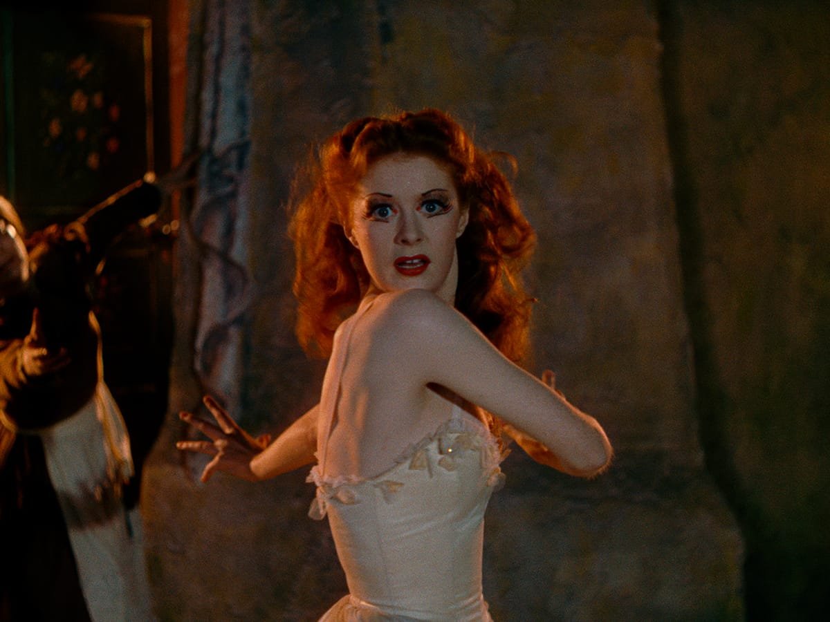
The Red Shoes (1948) — When Color Becomes Music
Powell and Pressburger returned to Technicolor the following year with The Red Shoes, and again pushed the process beyond conventional realism. The film's famous 17-minute ballet sequence is one of cinema's great achievements, and it's impossible to imagine in any other medium or process.
The ballet sequence uses color synesthetically—colors that respond to music, that shift with emotional beats, that become part of the dance itself. The red shoes pulse with an almost supernatural glow. Backgrounds shift from realistic theater sets to abstract expressionist dreamscapes. Colors bleed and blend and explode across the frame.
Jack Cardiff later described the sequence as "painting on film." Every color was meticulously planned, every combination tested. The Technicolor cameras were massive, but they allowed for extended takes and fluid camera movements that made the ballet feel both theatrical and cinematic.
The Criterion restoration of The Red Shoes is particularly revelatory because it shows how much information Technicolor captured. In 4K, you can see the texture of the dyes, the way colors layer and interact, the depth of the blacks and the luminosity of the highlights. It's not just restoration—it's revelation.
Leave Her to Heaven (1945) — Technicolor Noir
Film noir and Technicolor seem like opposites—one is shadows and moral ambiguity, the other is saturated primaries and studio gloss. But John M. Stahl's Leave Her to Heaven proves that Technicolor could be as psychologically dark as any black-and-white thriller.
Gene Tierney plays Ellen Berent, a woman whose obsessive love destroys everyone around her. And cinematographer Leon Shamroy uses color to signal her toxicity. Ellen is always dressed in intense, almost violent colors—especially red. Her lipstick is a weapon. Her clothes are warnings.
The film's most infamous scene—Ellen coldly watching her disabled stepson drown in a crystal-clear lake—is rendered in gorgeous, horrifying clarity. The deep blues of the water, the bright white of the boat, Ellen's dark glasses reflecting nothing, betraying nothing. It's beautiful and monstrous.
Leave Her to Heaven proved that Technicolor wasn't just for musicals and costume epics. It could be psychological, sinister, oppressive. The richness of the color becomes claustrophobic, overwhelming. There's nowhere to hide in a Technicolor frame—every sin is rendered in perfect, permanent clarity.
The Tales of Hoffmann (1951) — Opera Without Words
Powell and Pressburger's The Tales of Hoffmann is perhaps the ultimate expression of what Technicolor could achieve: a film-opera with virtually no dialogue, where color, movement, and music combine into something that exists purely as cinema.
Based on Jacques Offenbach's opera, the film tells three interconnected tales of doomed love. Each story has its own color palette: the Olympia sequence is dominated by golds and whites (a mechanical doll's coldness), the Giulietta sequence drowns in Venice's blues and blacks (romantic decay), and the Antonia sequence burns with reds and ambers (fatal passion).
What's remarkable is how un-theatrical the film feels despite being based on an opera. Powell and Pressburger used every Technicolor trick available: matte paintings, split-screen, miniatures, optical effects. They created impossible spaces that could only exist in cinema, where a character could literally walk from one color world into another.
The restoration process for The Tales of Hoffmann was particularly complex because the original film had been damaged and poorly preserved. Criterion's restoration required scanning the original three-strip negatives separately and digitally recombining them—essentially recreating the 1951 dye-transfer process digitally. The result shows just how much visual information Technicolor captured, information that survives even when the film itself has degraded.
French Cancan (1955) — Color as Pure Joy
Jean Renoir's French Cancan is the master humanist's first Technicolor film, and he uses color not for psychological depth or artistic reference, but for something simpler and more profound: joy. The film tells the story of the opening of the Moulin Rouge and the birth of the cancan as a dance craze in 19th-century Paris.
Where Powell and Pressburger used Technicolor for intensity and control, Renoir uses it for spontaneity and warmth. The film explodes with reds—the reds of costumes, of curtains, of wine, of passion. But these aren't the dangerous reds of Leave Her to Heaven or the mystical reds of The Red Shoes. They're celebratory reds, communal reds, the colors of life lived fully and without restraint.
The final cancan sequence is one of cinema's great expressions of pure kinetic energy. The dancers' skirts—white petticoats flashing against red and black—become abstract patterns of movement and color. Renoir's camera doesn't just observe the dance; it participates, swirling and spinning with the performers.
What makes French Cancan remarkable is how un-precious it is. After making The River (1951), his first color film, in India, Renoir returned to France and embraced Technicolor not as a technical challenge to be mastered, but as a tool for expressing warmth, energy, and theatrical delight. The film feels improvisational even though every color is carefully chosen, every composition deliberately framed.
It's Technicolor as populist art—not the refined aestheticism of Black Narcissus or the high art of The Tales of Hoffmann, but color in service of entertainment, community, and the pleasure of watching people dance. And yet it's no less artistically accomplished for being joyful.
The Cost of Perfection
Here's the uncomfortable truth about Technicolor: it was expensive. Ruinously expensive.
The cameras themselves were enormous—over 300 pounds for the three-strip model. They required special camera operators trained specifically in Technicolor technique. They were loud, making sound recording more difficult. They required more light than black-and-white cameras, meaning larger and more expensive lighting setups.
And that was just production. The printing process was even more costly. Every print required three passes through the dye-transfer system. Quality control was obsessive—Technicolor maintained its own laboratories and wouldn't license the process to other labs. If you wanted to shoot in Technicolor, you had to use Technicolor's cameras, Technicolor's operators, Technicolor's labs, and Technicolor's color consultants.
The color consultants were particularly controversial. Natalie Kalmus—Herbert Kalmus's ex-wife—held the title of Technicolor Color Consultant and had final approval over color design in virtually every Technicolor film from 1933 to 1949. Directors chafed under her control. She had definite theories about what colors should be used together, how saturation should be controlled, what was "in good taste."
Some filmmakers, like Powell and Pressburger, pushed back and got their way. Others found themselves overruled on their own films, forced to use color palettes that Natalie Kalmus deemed appropriate.
But here's the paradox: Technicolor's monopolistic control and obsessive quality standards are exactly why those films still look so good. Kalmus and her team understood the technology at a molecular level. They knew which colors would fade and which would last. They knew how to balance saturation so that films wouldn't look garish in ten years. They imposed discipline on an industry that might have otherwise produced beautiful but unstable images.
Still, the cost was prohibitive. By the late 1940s, Technicolor films cost 30-50% more than black-and-white films. And that was just average productions. Prestige films like Gone with the Wind or The Red Shoes cost even more, with multiple Technicolor cameras and months of post-production.
As television began to cannibalize Hollywood's audience in the 1950s, those costs became harder to justify.
The Beginning of the End
Eastman Kodak introduced Eastmancolor in 1950. It was a single-strip color negative film—instead of requiring three separate strips and complex optical printing, color information was captured directly on one piece of film, in layers of dye couplers.
The advantages were immediate: Eastmancolor cameras were smaller, lighter, quieter. Processing was faster and cheaper. And crucially, any laboratory could process Eastmancolor—you didn't need to go through Technicolor's controlled ecosystem.
The disadvantage? Eastmancolor wasn't as stable. The dyes faded faster, shifted color over time. Early Eastmancolor films from the 1950s now look pink or magenta because the cyan dye has faded. Technicolor films from the 1930s still look perfect.
But in Hollywood's cost-cutting 1950s, long-term preservation wasn't the priority. Films like Vertigo (1958) and North by Northwest (1959) were shot in VistaVision—Paramount's wide-screen format—using Eastmancolor. They looked good enough at the time, and they were much cheaper to produce.
Technicolor adapted by offering dye-transfer printing for Eastmancolor negatives. You could shoot in Eastmancolor and print in Technicolor, getting some of the stability advantages without the expensive three-strip cameras. This is how most "Technicolor" films from the late 1950s through the 1970s were actually made—they're not true three-strip Technicolor, but dye-transfer prints from single-strip negatives.
The last Hollywood film to use three-strip Technicolor production was Foxes of Harrow in 1947. The last film to use Technicolor dye-transfer printing was The Godfather Part II in 1974—though that was from an Eastmancolor negative.
By 1975, Technicolor had ceased all dye-transfer printing. The laboratories were shut down. The equipment was scrapped. The knowledge was scattered.
The technology that had defined color cinema for forty years was gone.
What We Lost
Here's what bothers me about Technicolor's disappearance: we didn't lose it to something better. We lost it to something cheaper.
Modern digital color grading is incredibly powerful. You can manipulate individual pixels, change colors on the fly, create looks that would have been impossible in the photochemical era. But digital color grading creates choices that Technicolor never allowed—infinite malleability that can lead to indecision, over-processing, or aesthetic choices that won't age well.
Technicolor forced discipline. The colors you captured were the colors you got. You had to make decisions on set, with lighting and production design, because you couldn't "fix it in post." The limitations created a visual language where color meant something specific, something intentional.
And technically, three-strip Technicolor still captures more color information than most digital cinema cameras. The dye-transfer process could reproduce a wider color gamut than modern digital projection systems. We've replaced one set of limitations with another—we've just convinced ourselves that the new limitations don't exist because the technology feels more flexible.
But look at a pristine print of Black Narcissus or The Red Shoes. Look at the depth of the blacks, the saturation of the reds, the way colors seem to glow from within the frame. That's not nostalgia—that's objective technical superiority in certain aesthetic dimensions.
We've made color easier, but we haven't made it better.
Preservation and Legacy
The Criterion Collection's work preserving and restoring Technicolor films is crucial because we're not just preserving movies—we're preserving a technological process that no longer exists.
When Criterion restores a three-strip Technicolor film, they go back to the original separation masters when possible—those black-and-white negatives that record the red, green, and blue information separately. These can be scanned at ultra-high resolution (4K, 6K, even 8K) and digitally recombined, essentially recreating the dye-transfer process in the digital realm.
This is how they restored The Red Shoes. The original dye-transfer prints had degraded, but the separation masters were intact. By scanning those masters and digitally recombining them with modern color science, Criterion created a 4K restoration that's arguably more faithful to the original photography than any theatrical print from 1948.
But this only works if the separation masters survived. Many haven't. Technicolor films where only the dye-transfer prints remain are harder to restore because you're working from the final composite, not the original elements. You're trying to reverse-engineer three-strip separation from a single image.
And for films shot in Eastmancolor and printed in dye-transfer? Those are a different problem entirely because the negative was single-strip to begin with. The dye-transfer print might be stable, but it can't capture more color information than the Eastmancolor negative contained.
This is why film preservation matters. This is why organizations like the Criterion Collection, the Academy Film Archive, and the Library of Congress keep fighting for funding and attention. We're not just preserving entertainment—we're preserving the last physical evidence of how a technological process worked, what it was capable of, what it looked like before it disappeared.
Why Technicolor Still Matters
There's a moment in The Wizard of Oz where Dorothy opens the door to Munchkinland. The image transitions from sepia to full Technicolor in a single, continuous shot—one of the most famous effects in cinema history.
What most people don't know is that this wasn't a special effect. It was practical. The Kansas interior was painted sepia, with a sepia-tinted door. Dorothy (a stand-in for the actual shot) opens the door, revealing the Technicolor set beyond, and the camera films the transition in real time.
That's Technicolor in miniature: technically complex, optically brilliant, and achieved through practical craft rather than post-production manipulation. The transition from black-and-white to color isn't added later—it's in the world, in the frame, captured permanently in those three strips of film.
When we talk about Technicolor today, we're not being nostalgic. We're recognizing that certain ways of seeing, certain ways of creating images, can be lost if we're not careful. Digital cinema is remarkable, but it's not the endpoint of visual technology—it's just the current iteration.
Technicolor films look the way dreams look: saturated, heightened, more real than real. That wasn't an accident. It was the result of a specific technological process that made specific aesthetic demands and enabled specific creative choices.
Understanding Technicolor means understanding that the medium shapes the message, that limitations can be productive, that craftsmanship and artistry are inseparable. It means looking at Black Narcissus or The Red Shoes or An American in Paris and recognizing that what you're seeing couldn't have been made any other way, in any other process, at any other time.
Those colors were captured on three strips of black-and-white film, transferred to dye matrices, and printed in layers onto another strip of film. That's not just how they were made—that's what they are. The process is embedded in the image.
And when the last Technicolor laboratory closed in 1975, we didn't just lose a way of making movies. We lost a way of seeing the world in color.
Some doors, once closed, don't open again.
But the films remain. And in their permanent, brilliant, impossible colors, they're still teaching us to see.
Further Reading and ViewingBooks:
Technicolor Dreams: The Fantasy Film Classics of Michael Powell and Emeric Pressburger by James Chapman
Glorious Technicolor: The Movies' Magic Rainbow by Fred E. Basten
The Dawn of Technicolor, 1915-1935 by James Layton and David Pierce
Criterion Collection Titles to Explore:
Black Narcissus (1947) — Spine #93
The Red Shoes (1948) — Spine #44
The Tales of Hoffmann (1951) — Spine #317
Leave Her to Heaven (1945) — Spine #1020
French Cancan (1955) — Spine #243
Documentaries:
Cameraman: The Life and Work of Jack Cardiff (2010) — Essential viewing on Technicolor cinematography
The Red Shoes: Making of — Criterion Collection supplement
For Technical Deep-Dives:
The American Cinematographer magazine archives (1930s-1950s) contain contemporary articles on Technicolor technique
The Academy of Motion Picture Arts and Sciences Margaret Herrick Library has extensive Technicolor documentation